About Me

My photo
London, United Kingdom
Illustrator living in East London. I believe Illustration is not just about drawing, but is anything visual that communicates a message to an audience. To facilitate my creative skills, I like to work in moving image and photography as well as on the drawing board. I will be regularly updating this blog with my most recent masterpieces! If you are interested in commissioning me or simply have a querie, please contact me at: hello@lucy-e.com, @LucyJEvans or visit my website at www.lucy-e.com. Enjoy...

Monday, 22 November 2010

'A recipe for... the perfect pancake'

Dot dot dot


Final design ideas for the '...' in 'A recipe for...' - a zine our course is putting together to fundraise for our London show in June. I got a bit into the moon theme for some reason! I love the wise old face of the old man moon ...Will post up the final cover design once it is finished!

Loss


Development work for my D&AD project to illustrate the song Hide and Seek by Imogen Heap. I get the feeling the song is about loss, so I have used negative space to demonstrate the loss of somebody close. Just a preliminary idea, but quite nice I think.. I finally saw her live in Bournemouth a few weeks ago (after being a fan for years) and her show blew me away. It was absolutely stunning, she is an even bigger inspiration to me now than she was before.

Practising hair

Not particularly keen on the body in this but am happy with the hair and tail. For my final piece, I played around the body to make it look less static. See the final below....

Nautical Nonsense


This is the final piece for the Nautical Nonsense brief; a monthly competition which takes place in Bournemouth. There is a different theme for each month and the shortlisted entries are exhibited at 60 Million postcards bar where A2 prints of each piece are for sale! I got through to this stage which is so exciting as it is the first time my work will be properly exhibited and (hopefully) sold!

Monday, 11 October 2010

Portrait


It was my Nan's 90th birthday on October the 8th (Congratulations Nanna!) and I wanted to make her a special gift. A portrait was the perfect answer. It took me quite a few hours to finish but I am really happy with the result. It is probably the closest resemblance I have achieved in a portrait and I am pleased to say she loved it too!

Saturday, 18 September 2010

Tattoo design
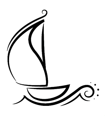


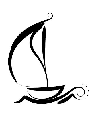
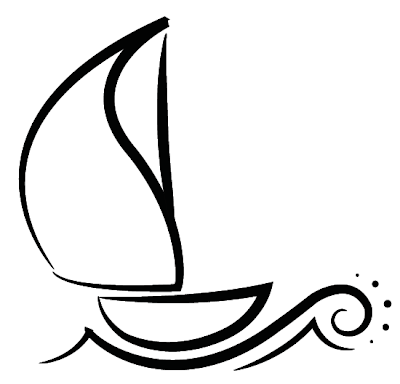
I was asked this summer to design a tattoo and I jumped at the chance! After all, isn't a tattoo the ultimate form of design.. A piece of artwork that will be exhibited for a lifetime. She wanted a sail boat to remind her of the sea and her travels around North America, something a little bit decorative but quite simplistic at the same time. Here are a few of the final developments.

This project has also pushed me into using Illustrator and I definitely now feel more confident with the programme.

Thursday, 12 August 2010


Yeeeey! The paper wearers are live online! Collaborating with a fashion student was an interesting and fun experience and I would love to work like this again. I'm really happy with how kitsch the dolls look.

Sunday, 20 June 2010

Divergence


This was my final project of second year, it is about the divergence of the body and soul when you die. It is a metaphorical piece in which the soul is represented by the water. I came up with the concept of portraying the soul through water/liquids as water symbolises life, spirituality, ‘life-giving’, subconscious, transformation, calamity and many more. I chose to keep the rest of the composition fairly simply as there was plenty of movement and variety shown through the liquids/soul. After all, the body/face had to depict death so the more still, the better. The constant opening and shutting of eyes reinforces and reflects the notion of your eyes being the window to your soul and what could be the intense process of the body and soul diverging. The faces are greyscale as having them in colour would make them appear alive and well. The de-saturated palette also contrasts well with the blue liquids and provides the ‘soul’ with a luminosity. Once I had found a suitable ‘song’ to work with the visuals, I cut up, distorted and edited it myself. I also added a few subtle sound effects which were moulded from recording a kettle boil! While I wanted a trace of rhythm to my soundtrack (to work the visuals to), I wanted to keep the rest mainly as odd, unfamiliar ‘noises’ - nobody is familiar to the sort of sounds you would hear when dying. The idea of having my film play on the backdrop screen of a concert/gig was a context that appealed to me and was always in mind. So it was therefore important to keep the visuals quite abstract and decorative (but still conceptual). I edited the film to the soundtrack I had created to get the sense that it was designed to accompany music.

This unit was called 'Digital Revolution Career and Practise' and was designed to further our understanding of digital media by encouraging us to explore illustration through screen based visual communication. At the start of the unit, we were taught the basics of using Flash and After Effects. It can be easy when using new software to forget all creativity because of the concentration on experimenting with actions/effects/transformations, which is why I made an effort to stay focused on the visual expression. I was cautious not to let the final piece of this unit be an experimentation reel of every effect/action under the sun, but to use the software as a tool to enhance my film rather than the programme itself turning out to be the main characteristic.

Although I am quite happy with the visuals, looking back it is quite repetitive and I feel it would have been advantageous to use different parts of the body such as hands, feet, arms etc to symbolise the body instead of solely using the face. I did have these thoughts when producing the video but convinced myself simply using the face would be better. Will take this on board for my next project and will listen to my instincts!


Tuesday, 4 May 2010

The Paper-eaters


This was a project I took part in for the Paper eaters 'art experience' taking place in the Ultralounge in Selfridges, Oxford Street. I had to illustrate artists Zoe Sinclair and Andrea Blood in a kitsch, caricature type style. These illustrations were then used on the website as dolls you can virtually dress! One requirement was that the 'dolls' had to be coloured digitally. I don't tend to work digitally to this extent so it was a chance for me to learn different ways of using colour in this medium. It was fun to be involved in a collaboration and am really happy with the result. There is also a chance the illustrations could be included in the artists magazine! So fingers crossed, I am waiting to hear of further developments...

Poster design


This is the draft and final poster (and logo) I recently designed for a cuban night that was organised by Arts and Events students. I really enjoyed engaging in graphic design again and being given a live brief to work to.

Thursday, 15 April 2010

Narrative

Rollie, Pencil. Representing the themes of Beauty and the Beast from a completely different angle. I decided to show the theme of ‘How the overpowering contentment somebody can feel about a certain thing can make the stereotypical unattractiveness of it irrelevant’ I chose to demonstrate this theme through the act of smoking so I could take it as far away from the original starting point as possible.


4 Mugs, Colouring pencil, digital manipulation.

Ink and pencil.

Pencil and felt-tip


Pencil, felt-tip and digital manipulation.

Pencil and digital manipulation. I really enjoyed working in this style of pencil drawing and am pleased with the results. The punch of bold, bright colour amongst the grayscale works really well. Will develop this on further...

OCD Awareness video - Visual Explanation

DSLR, pencil and colouring pencil. This is the final video for our Visual Explanation unit. We were randomly given a word and had to come up with a print or screen based outcome that visually explained said word. I was given 'Repetition'.

Monday, 5 April 2010

Followers